
TEIDA Trademark Patterns and Implications
Satisfaction means being highly responsible to customers and mutually beneficial to all parties.
Being upright means abiding by the law and operating in good faith.
This will become the basic values that Teida people pursue in dealing with people.
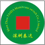
The shape of the pattern has the meaning of Brother Kong, indicating that business is booming and financial resources are expanding.
The design takes red and green as the basic color, and the green ball reminds us to pay attention to the environmental protection of the earth's homeland; the red symbolizes the happiness and auspiciousness of the Chinese people; and the red flag symbolizes the leader and the benchmark, indicating that Teida's goal is to be unique in the industry.
The design follows the principle that simplicity is beauty. Except for the two basic colors, which are the names of the company in English and Chinese, it has not been modified to highlight the pragmatic style.